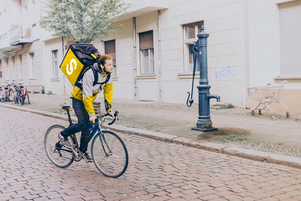
Spare it is a start-up charity, aimed at reducing food waste in restaurants and supermarkets, while providing fresh food to those in need. The brand needed to reflect the community-driven aspect and suit a variety of different contexts.

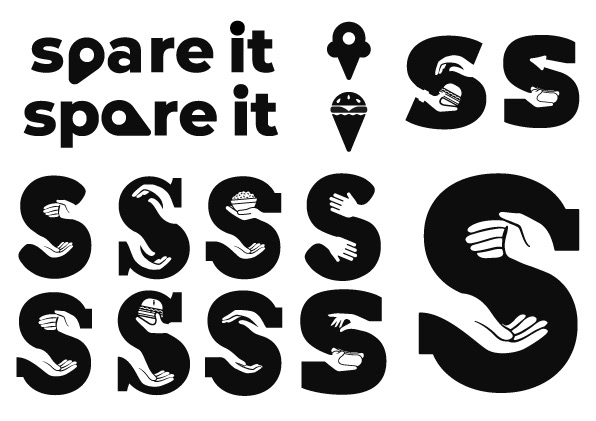
This process sparked the idea of a negative-space (giving) hand design which eventually lead to the current design. The reasoning behind this was that the brand aims to share, and pass, between hands so the logo had to demonstrate this perfectly.
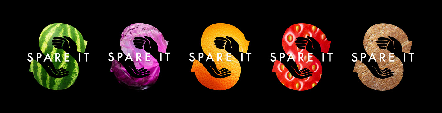
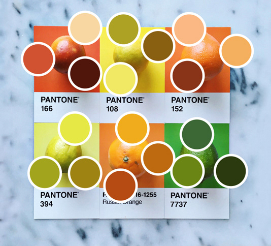
When creating a colour scheme, and art direction, the primary focus was food. Fresh, and vibrant gradients, inspired by the work of Lucia Litman, provided a spectrum to work the icon around. Finally, due to the simplicity of the design, food imagery was used to replace the colours giving even more life to the already vivid designs.